
Why Your Restaurant Needs a Website
Many small restaurant owners still wonder, “Do I even need a website when I have a social media page or a listing on Zomato or Yelp?”
The answer is a resounding yes. A well-built, mobile-optimized website gives you full control over your brand, customer experience, and digital marketing. Here are key reasons why every restaurant should have a well-designed website and why mobile optimization matters:
1. Improved User Experience
When someone lands on your site from a smartphone, they expect it to load quickly, display cleanly, and allow them to interact without friction. A mobile-optimized site ensures:
- Faster loading times: A delay of even a few seconds can lead to lost restaurant business. Mobile users are often on the go and won’t wait for a site to load.
- Easier navigation: Menus, buttons, and links are touch-friendly, reducing frustration.
- Click-to-call functionality: With one tap, users can call to ask questions or make reservations.
- Integrated maps and directions: Embedded Google Maps help customers locate your restaurant without leaving your site.
2. Higher SEO Rankings
Google has shifted to mobile-first indexing, meaning it predominantly uses the mobile version of your website for ranking and indexing. If your restaurant website isn’t mobile optimized, your visibility on search engines—especially local searches—will suffer. Why this matters:
- A mobile optimized website ranks better in search results, especially for keywords like “restaurants near me” or “best sushi in [your city]”.
- Google favors websites that load quickly, are mobile responsive, and provide a smooth mobile experience.
- Your restaurant’s mobile website also performs better on Google Maps and in local “3-pack” listings—the top three results that show when someone searches for nearby restaurants.
3. Increased Online Orders and Reservations
Online ordering and reservations are no longer limited to big chains. Independent restaurants can and should integrate these features directly into their restaurant website—especially for mobile users. With mobile optimization, the ordering process becomes seamless:
- Menus are easy to browse.
- Items are clickable and scrollable.
- Secure payment options are integrated.
- Reservation forms are simplified for fast booking.
Imagine a customer browsing your site during their lunch break. If your restaurant mobile website allows them to quickly place an order or reserve a table, you’ve secured their business in just a few taps. Without mobile functionality, customers might give up and look elsewhere. Moreover, integration with POS software can turn your website into a 24/7 booking and ordering hub.
4. Better Engagement with Customers
A mobile-optimized restaurant website also helps you build stronger relationships with your customers. Here’s how:
- Customer reviews and testimonials are easy to find and read.
- Social media integration allows users to jump to your Instagram or Facebook pages to see real-time updates, photos, or stories.
- You can include loyalty program signups, email newsletter forms, and promotional popups—all optimized for smaller screens.
This level of engagement encourages repeat visits, word-of-mouth referrals, and deeper brand loyalty. It also gives customers the tools to interact with your brand outside of mealtimes, which helps keep your restaurant top-of-mind.
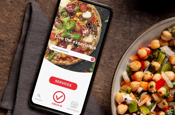
What Features Your Restaurant’s Website Should Have
To deliver an exceptional user experience, your restaurant’s mobile website needs specific features tailored for mobile users. Here’s what you must include:
1. Mobile Responsiveness
This means your website automatically adjusts to fit any screen size—smartphone, tablet, or desktop—without sacrificing functionality or design.
Why it matters:
More than 60% of people access restaurant websites on their phones. If your site isn’t mobile-responsive, it may display poorly, force users to zoom in and out, or make it hard to click buttons—all of which lead to frustration and higher bounce rates.
Example:
Compare two pizzerias: One has a mobile-optimized restaurant website that loads fast, adapts to the phone screen, and presents a clear menu with clickable items. The other forces users to pinch, scroll, and deal with cut-off text. Guess which one gets the order?
2. Contact Information
Your contact details should be visible and accessible—especially on mobile. A good restaurant mobile website has a “click-to-call” phone number, address linked to Google Maps, business hours, and email contact, all within a tap or two.
Why it matters:
Many users are searching with intent—either to make a reservation, place an order, or find directions. If this info is buried or hard to find, you’re missing out on immediate conversions.
Pro Tip:
Include your phone number in the site’s header or footer for quick access. And don’t forget to keep your hours updated—nothing frustrates a customer more than showing up to a “closed” sign after your website said you were open.

3. Social Media Integration
Your restaurant website builder and social media accounts should work together to tell your brand’s story. Adding social media buttons or embedded feeds (especially Instagram and Facebook) keeps your website dynamic and lets customers engage with you in real time.
Why it matters:
Many diners check Instagram before visiting a restaurant to look at food photos, ambiance, and recent posts. If they like what they see, they’ll click the link in your bio—which should take them to a mobile optimized restaurant website that seals the deal.
Example:
A local brunch spot embedded their Instagram feed on the homepage. It showed mouth-watering images of weekly specials and weekend events, helping them increase website engagement and attract foot traffic from curious foodies
4. Menu and Ordering Option
Your menu is one of the most visited pages on your restaurant site—but if it’s hard to view on mobile (e.g., uploaded as a PDF), you risk losing customers instantly.
What to do instead:
- Create a mobile-friendly, interactive menu that displays clearly on phones.
- Include item descriptions, prices, and dietary labels (like vegan, gluten-free).
- Add photos of your best-selling dishes.
- Integrate online ordering platforms or a built-in ordering system.
Example:
An Indian restaurant in Chicago embedded a simple “Order Now” button connected to an ordering system on their menu. Orders through their restaurant mobile website increased by 40% within two months.
5. Gallery
A dedicated photo gallery showcasing your dishes, interior, and events adds flavor to your website and helps convince undecided visitors to try you.
Why it matters:
High-quality, optimized images enhance your site’s appeal without compromising speed—a key factor in mobile optimization.
Example:
A trendy café used professional images of latte art, brunch boards, and its cozy seating area in a homepage gallery. Visitors browsing on mobile devices could swipe through easily, and it helped convey the experience even before walking in the door.

6. Promotions and Newsletters
Offering visitors a reason to return is a key strategy in online marketing, including effective email marketing campaigns. Adding a newsletter signup form or special promotions section on your restaurant website helps grow your email list and increase repeat business.
Ideas to include:
- First-time visitor discounts
- Happy hour or holiday specials
- Event invitations
- Loyalty program updates
Example:
A Mexican restaurant promoted Taco Tuesday specials through a pop-up form on their restaurant mobile website, offering 10% off for signing up. Within a month, they built an email list of 500 local subscribers.
7. Clean and Simple Look
A cluttered website confuses users and kills conversions—especially on mobile. Your restaurant website should be designed with simplicity in mind to streamline operations: clean fonts, spacious layouts, minimal colors, and clear CTAs like “Order Online,” “Book a Table,” or “Call Now.”
Why it matters:
Mobile users make quick decisions. A visually simple, easy-to-navigate site helps them find what they need without distractions.
Example:
A fine-dining steakhouse revamped its website with a minimal design, focusing on three main CTAs: view menu, make a reservation, and contact. Within weeks, their mobile conversions improved by 30%, simply because users could find what they needed faster.
Common Mobile Optimization Mistakes Restaurants Make
While many restaurant owners acknowledge the importance of mobile optimization, they still fall into common traps that compromise the effectiveness of their restaurant mobile website.
1. Slow Loading Time
Heavy images, unnecessary scripts, and poor hosting can cause load times of 5+ seconds. On mobile, every second counts—40% of users abandon websites that take more than 3 seconds to load.
2. Unreadable Fonts or Touch Elements Too Close
If your content isn’t legible or your buttons are too close together, users will get frustrated. Follow mobile design standards—minimum 14px font and adequate spacing between elements.
3. No Mobile Menu or Online Ordering Integration
Many restaurant websites use image-based menus or PDFs which are hard to view on phones. Others don’t integrate mobile ordering systems, which leads to lost revenue.
4. Overloaded with Large Images or Auto-Play Videos
While visual content is important, overdoing it can slow down your website and negatively impact performance on mobile data connections. Always compress images and avoid autoplaying media.
Conclusion
As mobile usage continues to dominate how customers discover, engage with, and order from restaurants, having a mobile optimized restaurant website is critical. It’s not just about looking good on smartphones—it’s about offering a seamless, fast, and intuitive experience that converts visitors into loyal customers.
From attracting foot traffic to increasing online orders and standing out in local search results, mobile optimization empowers your restaurant website to become a high-performing digital asset. Restaurants that adapt to this shift will stay ahead of the curve—those that don’t risk being left behind.
